
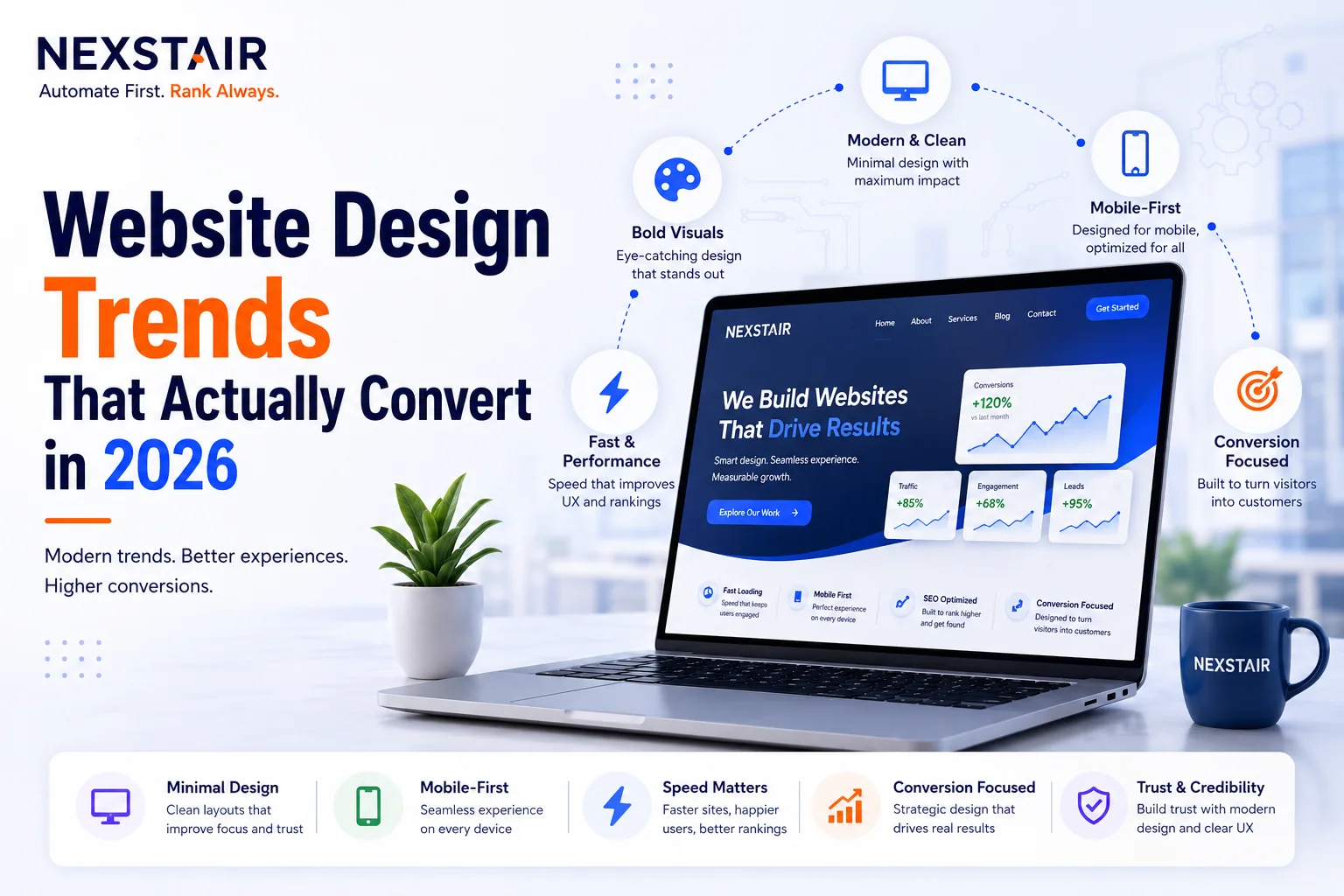
Website Design Trends That Actually Convert in 2026
Most “design trends” lists chase what looks impressive in a portfolio, not what moves a visitor toward a decision. In 2026, that distinction matters more than ever: the trends actually driving conversions are quieter, more functional, and often invisible to a casual glance, while the loud, flashy ones frequently hurt the metrics businesses actually care about.
Part of the reason this gap has widened is that 2025 was a year of experimentation. AI made its way into everyday design workflows, bold minimalism set the tone for a season of cleaner interfaces, and 3D previews gave everyone a taste of what immersive web experiences could look like. Those ideas felt genuinely fresh twelve months ago. In 2026, they’re simply expected, which means the trends that actually differentiate a converting site from a merely current-looking one have shifted further toward substance: how a page performs under real conditions, how clearly it communicates what to do next, and how much friction it removes rather than how much visual flourish it adds.
This guide covers the website design trends genuinely tied to conversion performance in 2026, not just aesthetic novelty, along with the older 2025 patterns that have become table stakes, the trendy ones worth approaching with caution, and the specific mistakes that undermine even a well-intentioned redesign. If your site needs a redesign built around these principles rather than trend-chasing, Nexstair’s design services team builds every project around measurable outcomes, not just visual novelty.
Why Conversion-Focused Design Looks Different From Trendy Design
A design trend earns a place on a conversion-focused list only if it reduces friction, builds trust, or clarifies what a visitor should do next. Bold, maximalist visuals photograph well for a design showcase but often increase cognitive load exactly when a visitor needs to make a decision. The strongest 2026 trends do the opposite: they get out of the user’s way.
Aligning intent with structure, not adding more buttons or pop-ups, is what separates a website that converts from one that just looks current. The rest of this guide breaks down which specific trends deliver on that promise.
The Trends That Actually Move Conversions
Mobile-First, Not Mobile-Adapted
Mobile traffic makes up the majority of web sessions in 2026, and designing for mobile first, rather than adapting a desktop layout afterward, has become the baseline for any conversion-focused site. This means optimizing touch interactions, simplifying layouts, and cutting unnecessary steps rather than shrinking a desktop design to fit a smaller screen.
The distinction between “mobile-responsive” and “mobile-first” is more than semantic. A mobile-responsive site takes a desktop design and reflows it to fit smaller viewports, which often preserves desktop-oriented decisions, dense navigation, small tap targets, multi-column layouts, that never worked well on a phone to begin with. A mobile-first process starts with the constraints of a small screen and one-handed use, then expands outward, which tends to produce simpler navigation, larger and better-spaced touch targets, and content hierarchy built around what a mobile visitor actually needs first. Sites that retrofit mobile support after building for desktop consistently show higher mobile bounce rates than sites designed the other direction, because the compromises show up as friction exactly where conversion decisions happen.
Progressive, Step-by-Step Forms
Long forms shown all at once remain one of the most reliable ways to lose a visitor mid-conversion. The 2026 standard breaks forms into smaller steps, revealing fields progressively, adapting based on earlier answers, and giving instant feedback as someone fills them out. This keeps a visitor moving forward instead of confronting a wall of fields that feels like work.
Micro-Interactions That Build Confidence
Small, purposeful movements, a button that responds visibly to a click, a loading indicator, a smooth transition between states, signal to a visitor that the site is working correctly and their action registered. These micro-interactions don’t need to be dramatic. Their entire value is clarity: a visitor who trusts that a click did something is far more likely to complete the next step.
Performance as a Design Constraint, Not an Afterthought
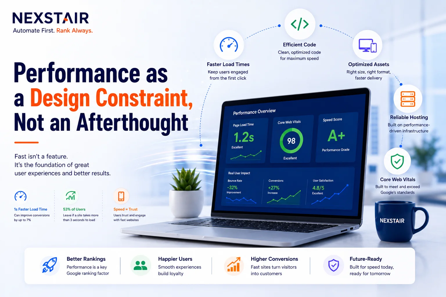
Fast-loading, responsive sites rank higher, retain more visitors, and convert better, and treating speed as a design constraint from the start produces smarter choices than optimizing a finished design after the fact. Compressed, next-generation image formats, lean layouts, and avoiding plugin overload all belong in the initial design decisions, not a post-launch cleanup list.
This shows up in specific, measurable choices rather than a vague commitment to “make it fast.” Serving images in modern formats like WebP or AVIF instead of legacy JPEG or PNG cuts file size substantially without a visible quality loss. Limiting third-party scripts, chat widgets, tracking pixels, embedded fonts from multiple sources, reduces the render-blocking overhead that quietly slows down even a well-designed page. Google’s Core Web Vitals, which measure loading speed, interactivity, and visual stability, are now a ranking signal published and tracked monthly, which means a design decision that hurts load time isn’t just a UX cost, it’s a visibility cost too. A page that looks polished but loads slowly on a mid-range phone over a typical mobile connection will lose conversions to a plainer, faster competitor more often than most design teams expect.
Intentional Simplicity Over Empty Minimalism
2026 minimalism is not the same as the stripped-back minimalism of a few years ago. A page reduced to a single centered paragraph and empty white space now reads as unfinished rather than sophisticated. What works instead is restraint that still does work: sharper visual hierarchy, stronger readability, considered micro-interactions, and clearer paths to conversion, all while a site still feels unmistakably tied to a specific brand through typography, spacing, and motion choices.
Accessibility-First Design
Accessibility has shifted from a compliance checkbox to a core design principle. Sites built with accessibility considered from the start, proper contrast ratios, keyboard navigation, screen-reader compatibility, tend to perform better for every visitor, not just those relying on assistive technology, because the same clarity that helps accessibility helps comprehension generally.
Privacy and Transparency as Trust Signals
Visitors are more aware of data privacy than in previous years, and sites that offer clear consent options, limit unnecessary data collection, and communicate honestly about what they collect are building trust in a way that directly supports conversion. A visitor who feels secure is more likely to complete a form or a purchase than one who feels their data is being handled carelessly.
Trends Worth Watching, With Caution
AI-personalized content blocks. Tools that adapt hero copy, images, and calls to action based on a visitor’s referrer, location, or prior behavior are gaining traction, and early data suggests meaningful lifts in click-through on personalized variants versus a static control. This is a genuinely promising trend, but it adds real engineering complexity and needs careful testing before a business commits to it as a core strategy rather than an experiment.
Bright, saturated color and Y2K-influenced aesthetics. A comeback of bold color palettes is a real 2026 trend, but it’s higher-risk for conversion-focused design than the functional trends above. It can work well for brands where personality and memorability matter more than a narrow, task-focused conversion path, but it needs to be tested against a business’s specific audience rather than adopted by default.
3D and immersive visuals. Interactive product models and scroll-triggered animations create genuinely impressive experiences, and brands with a strong visual product (retail, furniture, fashion) can see real engagement gains from them. For a typical service business, though, this adds development cost and page weight that can work against the performance-first trends above unless implemented carefully.
2025 Patterns That Are Now Just Table Stakes
A few patterns that felt like trends in 2025 are simply expected baseline quality now, not differentiators: bento-style grid layouts, scroll-driven storytelling for longer pages, and strict Core Web Vitals discipline. Shipping a site without these in 2026 isn’t neutral, it reads as dated, even if nothing about the design is technically wrong.
Designing for AI-Assisted Browsers, Not Just Human Visitors
A newer consideration in 2026 is that some traffic now arrives through AI-assisted browsing tools that research and summarize a site on a visitor’s behalf before a human ever loads the page. A site with clear structure, fast load times, and content that reads cleanly to both humans and these tools captures value across two channels at once: the human visitor and the AI system researching for them. This overlaps directly with the same structural and performance principles that drive human conversion, which is part of why the fastest, clearest sites are increasingly winning on both fronts simultaneously.
How to Decide Which Trends Are Right for Your Site
Not every trend on this list belongs on every website. A useful filter before adopting any of them:
- Does this reduce friction in the path to conversion, or does it add a decorative step?
- Does this build trust, or does it just look impressive in isolation?
- Can this be measured, tested, and rolled back if it underperforms?
- Does this still feel like the brand, or does it feel like a template applied on top of it?
Trends that pass all four are worth shipping. Trends that only pass the second one are worth watching, not committing budget to yet.
Common Mistakes That Undermine Even a Well-Intentioned Redesign
A handful of recurring mistakes show up across redesigns that adopt the right trends on paper but still underperform once live.
Chasing a trend without a clear reason it fits the brand or audience. A bold color palette or an immersive 3D product viewer can genuinely help one business and actively hurt another. Adopting a trend because a competitor shipped it, without asking whether it serves this specific audience’s decision-making process, is one of the most common and avoidable mistakes in a redesign.
Redesigning the whole site at once instead of testing changes incrementally. A full relaunch makes it nearly impossible to isolate which specific change helped or hurt performance. Businesses that redesign a homepage hero, test it, then move to the next section tend to end up with a site where every major decision is backed by actual data, not just design intuition.
Treating accessibility as a final compliance pass instead of a starting constraint. Accessibility fixes added at the end of a project are almost always shallower than accessibility considered from the first wireframe, and they frequently miss deeper structural issues like poor keyboard navigation order or unclear focus states that a late-stage audit doesn’t catch.
Letting animation and micro-interactions multiply without a performance budget. A single well-placed micro-interaction builds confidence. A dozen of them stacked across a page, each adding its own script and render cost, can quietly turn a fast, polished site into a sluggish one, undermining the exact performance-first principle the trend was supposed to serve.
Skipping real-device testing in favor of design-tool previews. A layout that looks correct in a design tool or on a fast office connection can behave very differently on an actual mid-range phone with a weaker connection, particularly for anything involving animation, video, or large imagery.
How to Measure Whether a Trend Is Actually Working
Adopting a trend and confirming it helps are two different steps, and skipping the second one is how businesses end up with a site that looks current but performs the same as before. A few practical checks matter more than the trend itself:
Track conversion rate before and after, not just traffic. A redesign that increases visits without increasing completed actions, form submissions, sign-ups, purchases, hasn’t actually improved the metric that matters. Isolate the change and measure against a clear baseline period.
Watch bounce rate on the specific pages that changed. If a new hero design, form structure, or navigation pattern increases early exits rather than reducing them, that’s a signal to roll it back or iterate rather than assume it needs more time to work.
Test on real device and connection conditions, not just a fast office connection. A trend that depends on animation, 3D visuals, or heavy imagery can perform very differently on a mid-range phone over mobile data than it does in a design review on a desktop monitor.
Give a change enough time to reach statistical relevance before judging it. A trend that looks like it’s underperforming in the first week can still be a genuine improvement once enough visitors have gone through it, particularly for lower-traffic sites where sample size takes longer to build.
Bringing These Trends Into a Real Redesign
The strongest 2026 websites treat design decisions as growth decisions, not style decisions made separately from business goals. Nexstair’s design services team builds sites around the trends genuinely tied to conversion, mobile-first structure, performance-conscious layouts, accessible and trustworthy design, rather than chasing whatever looks current in a portfolio. Reach Nexstair Technologies at +1 (307) 221-5230 or info@nexstair.com to talk through what a conversion-focused redesign looks like for your business.
Frequently Asked Questions
What website design trends actually improve conversions in 2026?
Mobile-first layouts, progressive multi-step forms, purposeful micro-interactions, and performance-first design consistently drive measurable conversion improvements in 2026. These trends work by reducing friction and building visitor confidence, rather than adding visual novelty.
Are bold, maximalist design trends bad for conversions?
Not inherently, but they carry more risk than functional trends and need testing against a specific audience before being adopted broadly. Bright color palettes and immersive 3D visuals can work well for brands where personality and memorability matter most, but they can also increase cognitive load in a way that works against a narrow, task-focused conversion path.
Is minimalism still a good design choice in 2026?
Yes, but only when it’s intentional rather than empty. 2026 minimalism is defined by sharp hierarchy, strong readability, and considered micro-interactions, not simply empty white space and reduced content, which now reads as unfinished rather than sophisticated.
How important is mobile design compared to desktop in 2026?
Mobile design should be the starting point, not an adaptation of the desktop version, since mobile traffic makes up the majority of web sessions. Sites designed mobile-first with simplified layouts and optimized touch interactions consistently outperform desktop-first designs adapted afterward.
Do accessibility improvements actually affect conversion rates?
Yes. Accessible design, proper contrast, keyboard navigation, screen-reader compatibility, tends to improve clarity and usability for all visitors, not just those using assistive technology, which supports conversion broadly rather than serving a narrow use case.
Recent Posts
Related Posts

Scale Your PPC Campaign Without Losing Budget
Scale your PPC campaign presents one of the most persistent dilemmas in digital marketing. When budgets increase, ad spend can...

Social Media Strategy for Small Business in 2026: Platforms, Budgets and AI Search Visibility
A social media strategy is a written plan that ties one business goal to a defined audience, two or three...
Technical SEO Services: How to Find the Right Company for Your Business
Technical SEO services (also called technical search engine optimization) are the fixes and checks that let search engines crawl, render,...
AI SEO for Small Business: What Changed in 2026 and What to Do About It
AI SEO for small business is no longer a future trend to watch. It is the environment every local shop,...
Are AI Web Crawlers Indexing Your Site Correctly?
For years, web developers have relied on JavaScript to power the modern internet, operating under the assumption that search engines...